Gerald Scarfe, Pink Floyd, and Cannibalistic Flowers
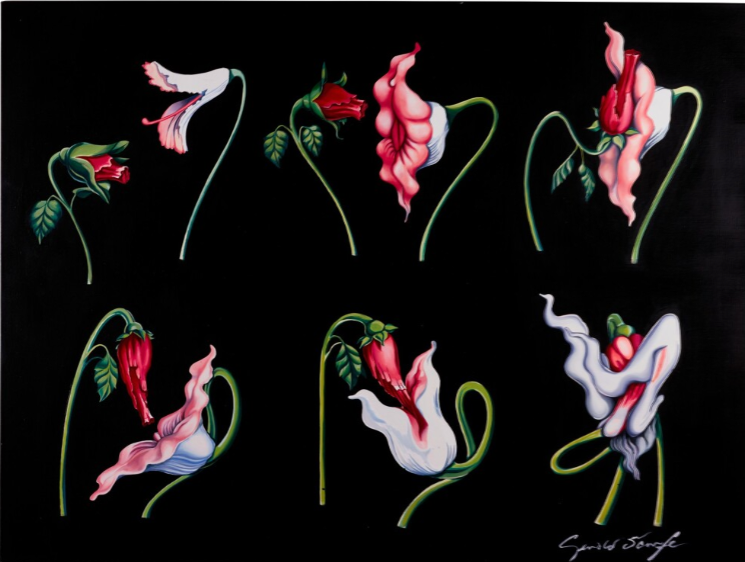
Six years after the worldwide success of Dark Side Of The Moon, Pink Floyd was looking for more and more intense visuals and creative ways to tell a story through music that wasn’t just words and melody. Pink Floyd’s eleventh studio album “The Wall” was a creation that, in the band’s eyes, would be an album, a tour, and a film. All of these, as well as the subsequent creation of a book, were made possible by the artist Gerald Scarfe. With his hands and the band’s minds, the foundations for the visual album were set into place, and quickly grew. Involved in the creation of the book in full, and helping with animated sequences in the movie, Scarfe created a masterpiece of animation, live concert footage, and live action scenes, all telling the story of a rockstar named Pink.
Gerald Scarfe was born in St. John’s Wood on June 1st, 1962. He was an asthmatic child, and so, in his early, bedridden years, he turned to drawing as a means to keep himself occupied. He claims that “the dark and grotesque images that often characterise his work are a result of his loneliness” in those weeks lying in bed. The young Scarfe was influenced by Ronald Searle, a war artist and a political cartoonist of the time. Scarfe would view all of the older artist’s work that he could, and would follow in the footsteps of his hero by becoming a cartoonist himself. He worked as an illustrator for magazines and newspapers until the Vietnam war. The depictions of war that the budding war cartoonist encapsulated, both on paper and animated, were staggering. After Pink Floyd saw one of his war animations, they immediately started to work with him.
The darker tones of “Empty Spaces” and by proxy, the entirety of the visual album come from these moments of solitude in a sick boy’s room. The background is a solid black, the colors of the flowers, though also solid, almost appear muted with the tone of the actions they pantomime. One is decidedly larger than the other, with opening petals in a diamond shape, the soft inner lines leading to the center, an obvious allusion to a vaginal opening. The other is a deeper red, with a large, bulbous end narrowing to a shaft. This is, similarly to its counterpart, obviously a penis. The vaginal flower is taller, larger, and appears to be in more control in the scenario versus the penile flower, which is smaller in size and more hesitant in movement.
As the two move around each other, they grow more confident. The vaginal flower opens more, appears softer, while the penile flower’s closed petals morph into a longer, stronger shaft, similar to an erection. While it rubs along the other flower’s petals, the vaginal flower moves lower, posing a more submissive stance. Here, is a very airy, exaggerated motion, the penile flower penetrates the vaginal flower. In the following sequences, the flowers morph into familiar angry, dark colors, fading from the innocent plants we originally saw them as. This heightens and grows in frenzy, as they become strange, monstrous heads biting at each other. Ultimately, the vaginal flower grows to a gigantic size, swallowing the penile flower entirely, and flying off as a pterodactyl. What an end.
Scarfe has said that the work of Roger Waters and Alan Parker made the process of visualizing images and scenes for the movies very streamlined. In meetings, the three would discuss their visions, pulling ideas from each other and scrapping parts that were deemed inadequate. The band was not afraid to say when they didn’t like something, and Scarfe wasn’t afraid to fight back and justify his angle. Empty Spaces' style and message was one of the quicker decisions for the band. They fell in love with Scarfe’s concept sketches and gave him full control of that scene. Though it is only a piece of the book and the movie, Empty Spaces' visuals are the most popular section of the piece, known by many even if they are unaware of its origins. The clip is circulated on social media as a “lost animation” every few months, recapturing the public’s attention and bringing up questions from a younger generation.
In case you were concerned, by the way, the album, the book, and the movie were all a great success. After his work with the band, Scarfe would go on to create more political cartoons, assist in the creation of Disney’s Hercules in 1997, and created costumes and scenery for plays and theatrical performances, most notably the Nutcracker in 2002. (I would like to apologize for my misleading information, Scarfe was not an "ex-Disney employee" at this time, but would become a Disney employee in the late 1990s). His style lived on past the work he did with Pink Floyd, as, when working on Hercules, he was the main concept artist for characters such as Hades, The Fates, Megara, and even Hercules. The darker style is seen in The Fates, certainly, but the fluid, writing lineart and similar coloration in the others is Scarfe’s signature, living on past procreating flowers.
The sexual culture of 1979 was a changing space. The sexual revolution of the sixties had “died down” (become more the norm), but there were still societal issues that had not been resolved yet. For example, gender roles were changing, with more women entering the workforce. Attitudes towards homosexuality were also shifting, however slowly. There are parts of the opening of “Empty Spaces” that depict the two flowers as similarly penile, even in brief frames. 1979 was also a big time for sexual assault research. More resources were created for victims of sexual assault, with hospitals and psychiatric wards, though in that time, the latter may not have been the best first choice.
This scene in the album represents, when aligned with the song, Pink’s wife’s infidelity. He has given himself to her wholeheartedly, only to lose his sense of manliness in the process. In the time since the movie premiered, many viewers have put forth their ideas on what this scene is meant to depict. Today, this scene has been widely interpreted to represent sexual assault, both for men and women. So, why is this a good choice for the face of the course? I ask you to revisit the class’s label. The title of this class isn’t solely for women, it’s title is “Sexuality and Modern Visual Culture”. While the class’s main focus may be on the female form, there are also many depictions of men and male presence, be that on the canvas or behind the paintbrush. This image, in that vein, does what the class does; shows and tells. We have heard of the comparison of flowers to anatomy hundreds of times, but has there been a clearer depiction of that metaphor in action than the one we show you here? The scene is beautiful and, at times, uncomfortable; the viewer doesn’t need to watch the sequence a million times to get the message or understand what is being portrayed. It is raw and direct, exactly like the course.
(Originally submitted as an assignment for Sexuality and Modern Visual Culture - Spring 2025 )
Comments